Not so common area
The Student Commons building, attached to the Arts and Humanities building, is purposeful work of art to one San Diego City College student
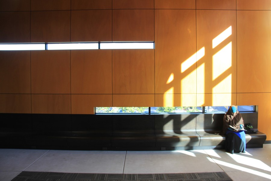
San Diego City College student Rahma Hassan sits in the Student Commons building, located by the AH and BT buildings on the corner of 16th and C Streets, on Nov. 16. Photo credit: Mike Madriaga
December 15, 2015
Rahma Hassan is a 20-year-old City College student who not only adores the color scheme of the Student Commons building on the corner of 16th and C Streets, she finds peace from within.
This was only Hassan’s second visit.
“I felt like it was restricted and thought it was (exclusively) for events,” Hassan mentioned. She initially surveyed it early in the spring semester to take an Instagram photograph and when she entered the double glass doors; she then quickly exited. “One of the reasons why it’s always empty is because of the heat and there are no tables and chairs as well,” she said.
In November, despite the massive amounts of sunlight entering through the enormous glass facing the south side, the confines remained cool as its demure.
“The Student Commons building was designed to be like the hipster version of the treehouse, where students can congregate above and away the activity of the street in a more serene place,” said Ralph Roesling from Roesling Nakamura Terada Architects. “It has the quality of a porch space with the outside air always flowing through it, as it is not air-conditioned nor weather sealed.”
Hassan noted that during her study session inside, she left the front doors open for ventilation, and more students arrived.
The structure, also known as the “mailbox”, is part of the Arts and Humanities five-story building to its left and can be accessed from the second floor.
The avant-garde building is bold, especially during night class. Depending on the angle viewed, the lighting and pattern of the adjacent and connecting staircases bring attention to the subtly clean, box-looking structure.
“The design process included input from the user groups of the building in various design stages (Conceptual, Schematic, Design Development, Etc.),” emailed Tom Fine, City College Campus Project Manager. “I believe the design team captured the user group’s desire for a student commons as part of this project and then utilized some sense of artistic license to come up with the actual building and space design.”
The interior is equally as subtle.
The simplicity brought about the wooden panels that line the walls and ceiling and appear seamless with the long benches, which face one another on the opposing walls. The carpet that resides in the middle of the concrete has a geometric pattern that is cohesive to the engraved lines within the cylindrical pillars supporting the building.
The six light fixtures atop are blanketed with a plastic that is complemented below with a long translucent desk embedded with light emitting diodes (LEDs). The window dividers cast a strong shadow on the east-side wall, which will align or cross with the two horizontal peep-windows, depending on the location of the Earth.
The subtleties, such as the electric outlet covers that line the bottom of the benches, have a semi-gloss and textured finish, and the stainless steel plate that supports the building manifesto sign up front, are indicators of the attention to detail performed by the RNT architects.
“The interior space is not complete yet and will be gaining some comfortable and informal seating furnishings as a next step,” Roesling replied to Hassan’s concerns.
The “half full” or “half empty” notion need not apply to this “not so common” area in City College, as its uber-unique design, further framed by the skyline of Downtown San Diego, bring an extraordinary aesthetic that is inviting to current and prospective students, whether furnished or not.


